Many organizations spend significant time and effort on counter-phishing programs and training. The emphasis of these mitigation is always preventing the click; how to see it, how to stop it, and how to report it in a timely manner.
Rarely though, does anyone ask why the end user clicks on a malicious email. There’s a variety of psychological triggers that prompt a bad outcome of clicking on malspam, but an interesting one is that you might have trained them to do it.
And if you think email is dead, think again. A 2019 study by Adobe Analytics found US-based workers spend an average of 3 hours a day managing work email. Practically speaking, no one can directly engage with that much email using 100% of their critical thinking capacity.
As a result, users tend to rely on heuristics to manage the cognitive load, such as rules sorting content into different folders, only reading subject lines, or sometimes ignoring some types of messages altogether.
In somewhat of an escalating arms race for attention, corporate comms teams can often add things like “ACTION REQUIRED”, “URGENT”, highlight portions of text, or load up the email with HTML and various trackers. Many people view those sorts of messages as just petty annoyances, but let’s take a look at some actual phishes to see why they might actually be dangerous.
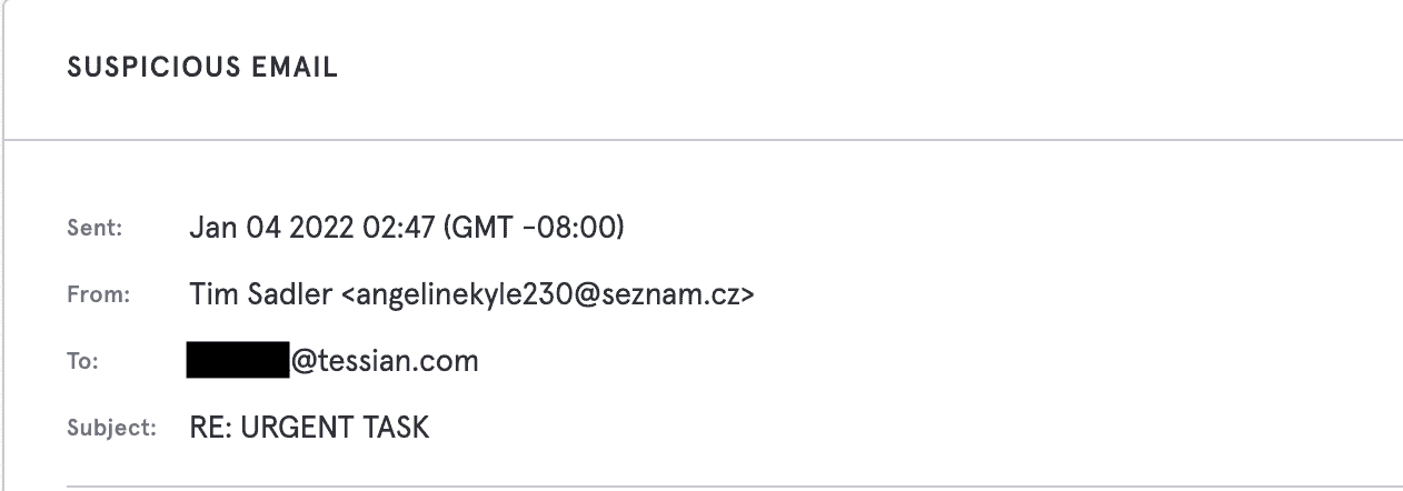
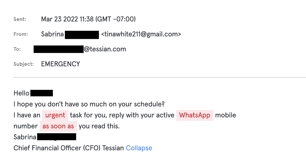
As we can see, two scammers attempting to impersonate Tessian executives rely very heavily on a sense of urgency to short circuit critical thinking skills that would easily catch out these phishes.
While on their own they’re not very sophisticated at all, when sent to an organization that bombards their users with urgent action required emails, the environment has already trained the users to look out for and at least open such messages. As a result, false urgency is very frequently found in almost any malicious email. Let’s look at how formatting can abuse user trust as well.
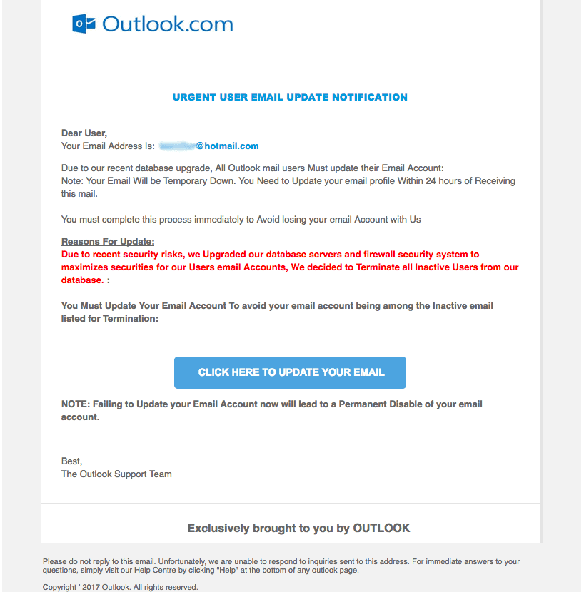
A recent post on the Microsoft Support forums
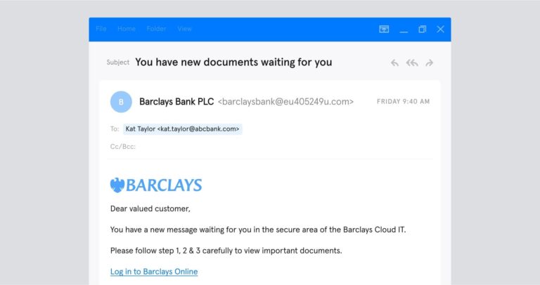
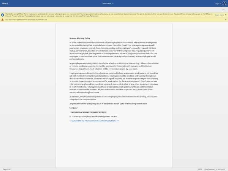
This looks pretty good for the average phish, but we can mark it as malicious due to poor language skills alone. However, IT teams will commonly use formatting very similar to this to announce server upgrades and request user action.
Organizations will hide links behind buttons to be “friendly’, use red text to highlight a tl;dr, or use bolding liberally to draw the eye. While a deep read will reveal the above phish as fraudulent fairly easily, a user inundated with email is not going to deep read anything – especially if their IT team uses similar formatting on a regular basis.
A positive counterexample

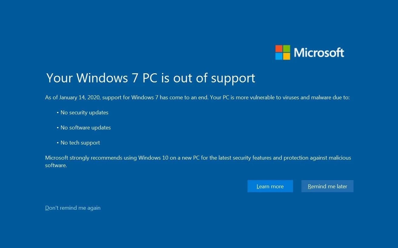
Microsoft, once renowned for the most inscrutable error messages of all time in earlier versions of Windows (see above), has been putting increasing thought into how to communicate in effective ways with the end user. Let’s see how they communicate that a user’s operating system is at end of life for support.

This can serve as a reasonable guide to how to communicate facts to the end user and request an action be taken. The negative outcome is centered, at the top, and large enough to be read first, but without any highlights or red text to suggest undue urgency.
Consequences of this outcome are listed clearly in idiomatically correct and simple English. Lastly, the recommended action (clicking to be guided to an upgrade page) is gently highlighted but not required, and other options are presented to the user to avoid any pressure for a particular action.
Going against the grain of most corporate communications that tend to be quite directive, Microsoft is presenting simple facts in a clean, unhurried way, and providing options for action at the end user’s preferred pace.
Taking design cues from this error message can prompt a harried employee relying on heuristics rather than close reading to slow down and only take action when they have the resources to do so in a considered manner.
Lessons learned
Sending messages to your employees that share design cues with phishes is not a great security outcome. So how do we do better? Comprehensive phishing solutions can catch a lot of nastiness on the front end and keep it out of the inbox. But empowering users to spot and flag malicious content on their own can be a great adjunct strategy to catch threats that never make it to security staff. We can help them do that by taking a deep look at what sort of information handling environment the user lives in and designing communication that makes full use of critical thinking easier rather than harder.

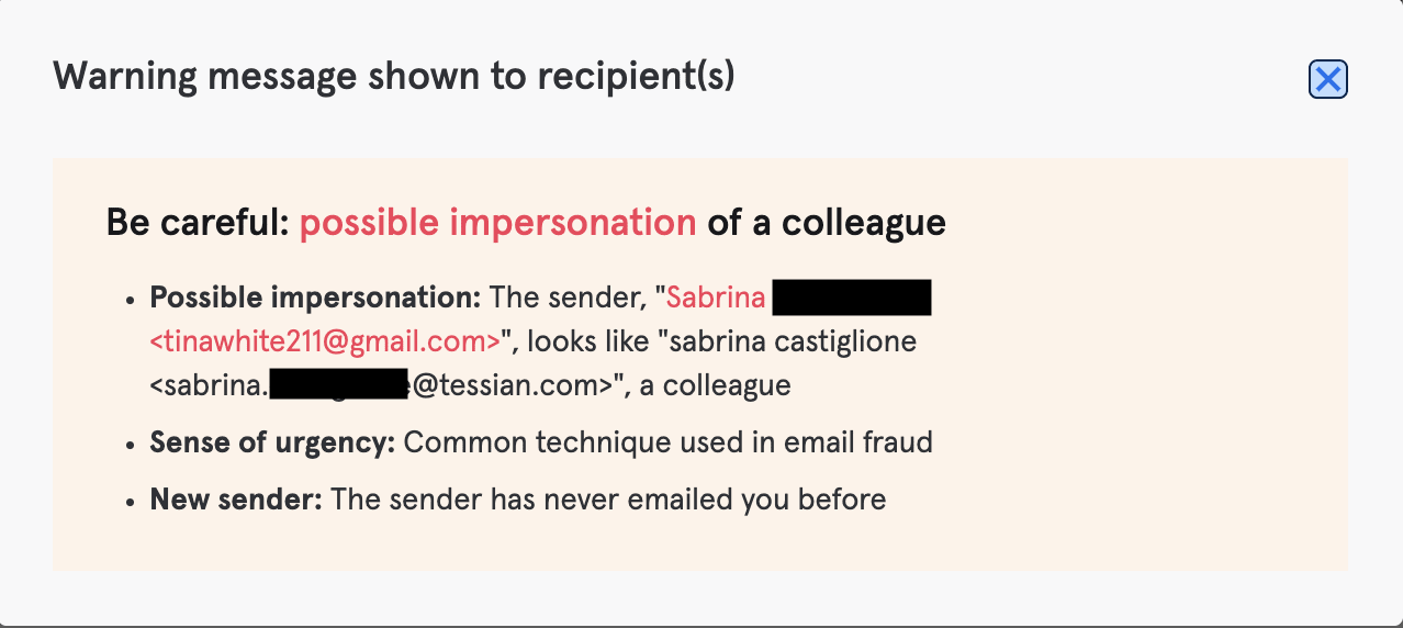
The above attacks were all caught via Tessian’s Defender module, with end user warnings like the one here. Breaking up the user’s typical email experience and providing clear, simple information necessary to make a good judgment on the emails’ authenticity.
In these instances, augmenting technical controls by giving the user timely guidance helped us enable good outcomes for the attacks. As with most email attacks, focusing on human factors has been a very effective force multiplier in keeping the organization safe.
KC O'Carroll
Head of Security Engineering & Operations


